
WELCOME TO ONE OF A STYLE BLOG
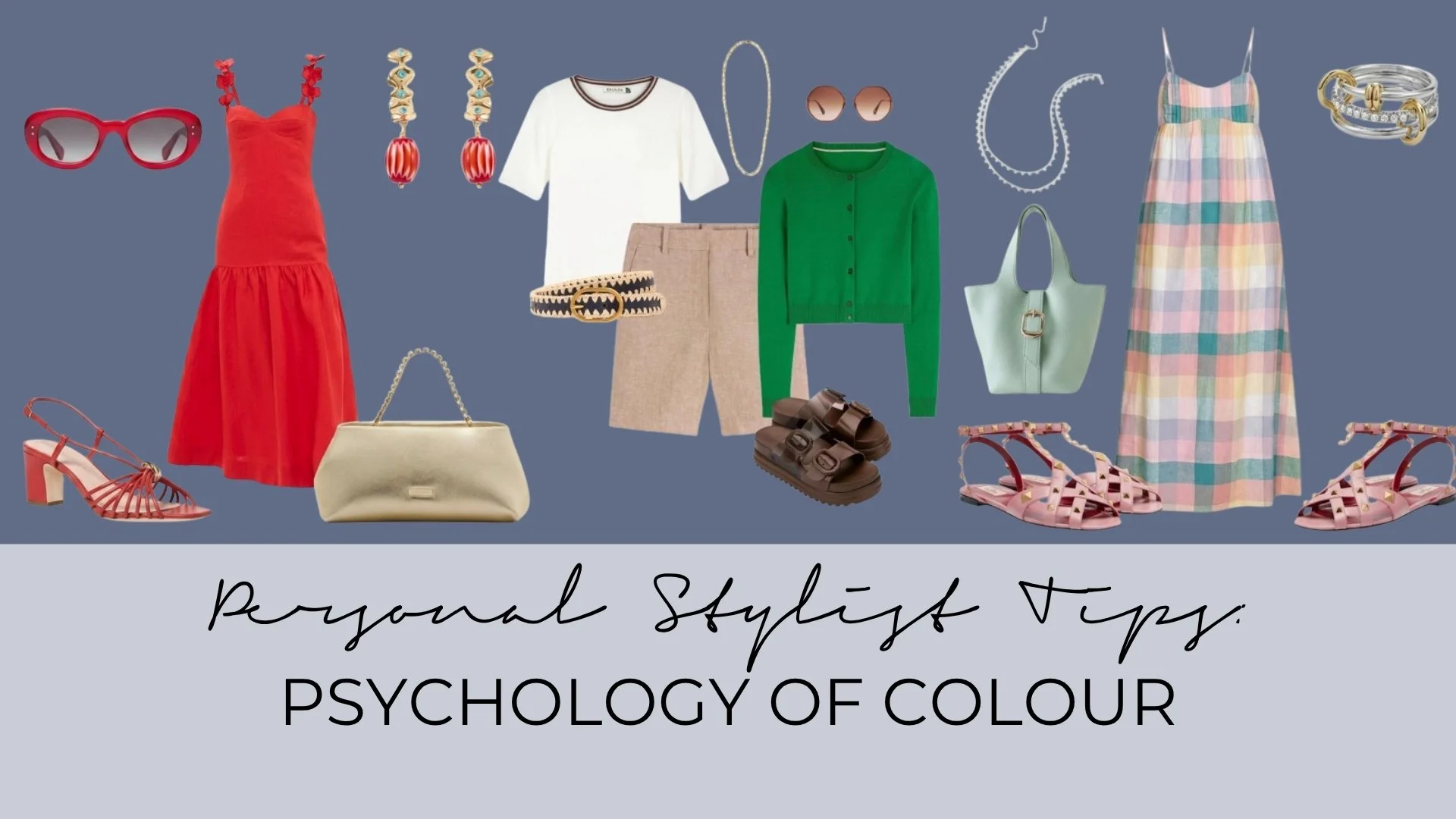
PERSONAL STYLIST TIPS: THE PSYCHOLOGY OF COLOUR - WHAT YOUR OUTFIT COLOURS SAY ABOUT YOU
We’re diving into the fascinating psychology behind colour—what your outfit says about you, how others interpret it, and, most importantly, how to harness colour to boost your confidence, elevate your mood, and align with your personal and professional goals.
Let’s explore how you can dress with intention and let your colours do the talking.
Have you ever walked into a room and instantly felt more confident, calm, or commanding—just because of what you were wearing? That’s the power of colour psychology. The hues you choose don’t just reflect your mood—they shape it, and they send subtle signals to the world about who you are, how you feel, and even how you want to be perceived.
This month, we’re diving into the fascinating psychology behind colour—what your outfit says about you, how others interpret it, and, most importantly, how to harness colour to boost your confidence, elevate your mood, and align with your personal and professional goals.
Let’s explore how you can dress with intention and let your colours do the talking.
What Your Outfit Colours Reveal About You
Colour is a non-verbal language, and every shade you wear communicates something—whether you realise it or not. Here’s what some of the most common colours in your wardrobe might be saying about you:
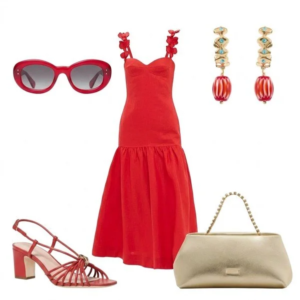
1. Red: The Colour of Confidence and Passion
If red is a staple in your wardrobe, you’re likely bold, ambitious, and unafraid to stand out. Red is the colour of energy, power, and action. It’s the shade of leaders, go-getters, and those who aren’t afraid to take charge. Wearing red can boost your confidence and even increase your perceived authority in professional settings. However, it can also come across as intense or dominant, so use it strategically—perhaps for a big presentation or a day when you need an extra dose of courage.
How to Wear It:
For Work: A red blazer or tailored trousers paired with neutral tones (like black or white) keeps the look professional yet powerful.
For Social Events: A red dress or bold lip signals confidence and charisma.
2. Blue: The Colour of Trust and Calm
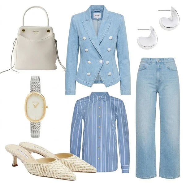
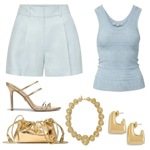
Blue is the colour of trustworthiness, stability, and calm. If your wardrobe is filled with blues, you’re likely analytical, reliable, and approachable. Blue is often associated with intelligence and professionalism, making it a favourite in corporate settings. Lighter blues (like powder blue or sky blue) can feel soothing and open, while deeper blues (like navy) convey authority and dependability.
How to Wear It:
For Work: A navy suit or blouse exudes professionalism and trust.
For Relaxation: Powder blue or soft pastel tones create a serene, approachable vibe.
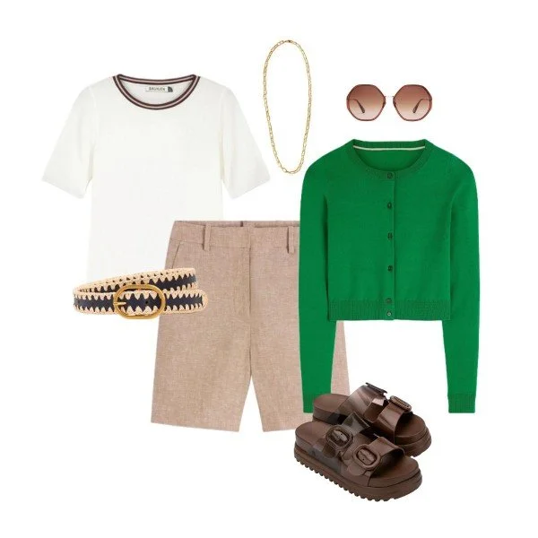
3. Green: The Colour of Balance and Growth
Green is the colour of harmony, balance, and renewal. If you gravitate toward green, you’re likely nurturing, compassionate, and in tune with nature. Green can also symbolise ambition and prosperity (think of the phrase “green with envy” or the association with wealth). Darker greens (like emerald or forest) feel sophisticated and grounded, while lighter greens (like mint or sage) evoke freshness and tranquillity.
How to Wear It:
For Work: An emerald green blouse or dress paired with neutral bottoms feels polished and balanced.
For Casual Outings: Here is where you can try a brighter orange with more neutral tones, perhaps a blazer, shoes or a cardigan.
4. Yellow: The Colour of Optimism and Joy
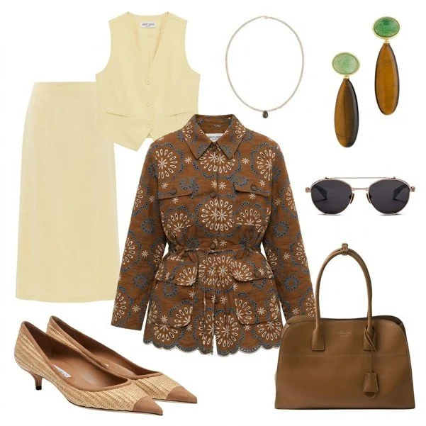
Yellow is the colour of happiness, creativity, and warmth. If you love wearing yellow, you’re likely optimistic, energetic, and outgoing. Yellow can lift your mood and the moods of those around you, but it can also feel overwhelming in large doses. Soft, buttery yellows feel warm and inviting, while brighter shades (like lemon or mustard) are bold and attention-grabbing.
How to Wear It:
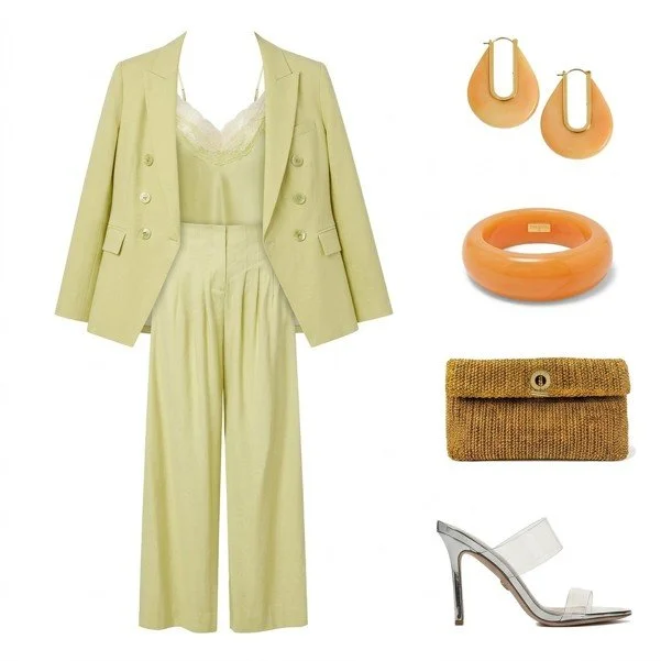
For Work: A butter yellow suit, blouse or accessories (like a bag or scarf) adds a cheerful pop without being too loud.
For Social Events: A bright yellow dress or skirt radiates joy and confidence.
5. Pink: The Colour of Compassion and Playfulness
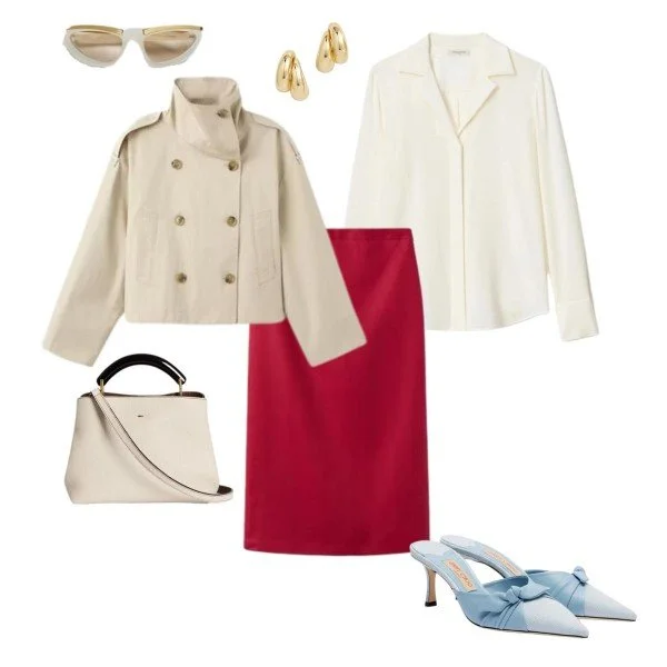
Pink is often associated with femininity, kindness, and playfulness, but it’s also a colour of strength and compassion. If pink is your go-to, you’re likely warm, empathetic, and in touch with your emotional side. Soft pinks (like blush or ballet slipper) feel gentle and romantic, while bolder pinks (like fuchsia or magenta) convey confidence and boldness.
How to Wear It:
For Work: A pink blazer or pencil skirt paired with neutrals feels professional yet approachable.
For Casual Outings: A fuchsia dress or top adds a playful, confident touch.
6. Black: The Colour of Sophistication and Mystery
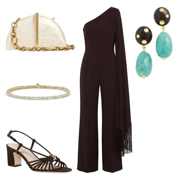
Black is the ultimate chameleon colour—it can feel sophisticated, mysterious, or even rebellious, depending on how it’s styled. If black dominates your wardrobe, you’re likely elegant, independent, and in control. Black is often associated with power and authority, but it can also feel heavy or sombre if overused. Balance it with lighter shades or textures to keep your look dynamic.
How to Wear It:
For Work: A black blazer or dress is a timeless, powerful choice.
For Evening: Black with metallic or jewel-toned accessories feels glamorous and mysterious.
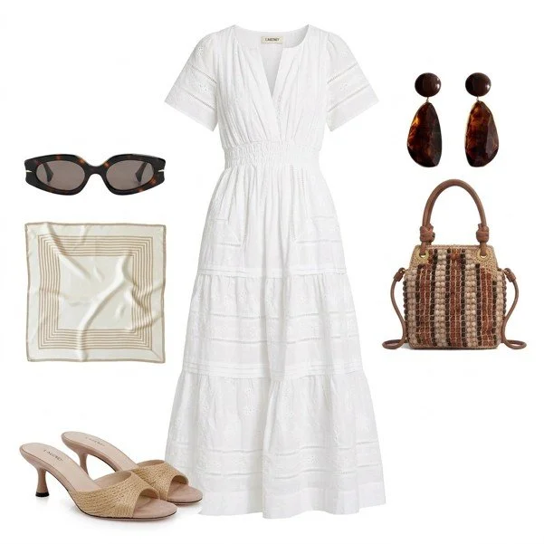
7. White: The Colour of Purity and Clarity
White symbolises purity, simplicity, and clarity. If you love wearing white, you’re likely organised, detail-oriented, and value cleanliness and order. White can feel fresh and crisp, but it can also be intimidating to wear (hello, coffee spills!). It’s perfect for summer wardrobes and can be dressed up or down with ease.
How to Wear It:
For Work: A white blouse or trousers feels crisp and professional.
For Casual Outings: A white sundress or linen shirt is effortlessly chic.
How to Use Colour to Boost Your Confidence
Now that you know what your colours might be saying about you, let’s talk about how to use them intentionally to boost your confidence, elevate your mood, and align with your goals. Here’s how to harness the power of colour psychology in your everyday life:
1. Dress for the Mood You Want to Feel
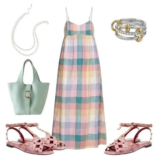
Colour has a direct impact on your emotions. If you’re feeling sluggish or unmotivated, wearing bright, energising colours (like red, orange, or yellow) can give you a mental boost. On the other hand, if you’re feeling stressed or overwhelmed, softer, calming colours (like blue, green, or lavender) can help you feel more grounded and at ease.
Try This:
Need Confidence? Wear red or deep purple to feel powerful and in control.
Need Calm? Opt for light blue or sage green to feel more relaxed.
Need Joy? Choose yellow or pink to lift your spirits.
2. Use Colour to Align with Your Goals
Think about the message you want to send in different areas of your life. For example:
At Work: If you want to project authority, incorporate navy, burgundy, or charcoal into your wardrobe. If you want to feel more creative, try teal, mustard, or coral.
On a Date: If you want to feel romantic, wear soft pinks, deep reds, or rich purples. If you want to feel playful, opt for bright pinks or oranges.
For Relaxation: If you’re heading to a spa day or yoga class, wear soft blues, greens, or whites to enhance the calming vibe.
3. Balance Your Colours for Harmony
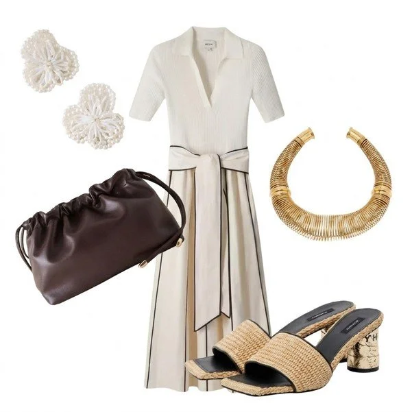
While it’s fun to experiment with bold colours, balance is key. If you’re wearing a bright or intense shade, pair it with neutrals (like black, white, or beige) to keep the look harmonious and polished. Similarly, if you’re wearing multiple colours, stick to a cohesive palette (e.g., warm tones together or cool tones together) to avoid clashing.
Try This:
Monochromatic Looks: Stick to one colour family (e.g., all blues or all pinks) for a sleek, elongated silhouette.
Complementary Colours: Pair opposite colours on the colour wheel (e.g., blue and orange, or purple and yellow) for a bold, high-impact look.
Analogous Colours: Use colours next to each other on the colour wheel (e.g., blue, teal, and green) for a cohesive, calming effect.
4. Use Colour to Enhance Your Natural Features
Certain colours can enhance your natural beauty by complementing your skin tone, hair colour, and eye colour. This is where colour analysis (like the 4 Seasons method) comes in handy. For example:
Warm Undertones: If you have golden or peachy undertones, warm colours (like coral, mustard, or olive green) will make your skin glow.
Cool Undertones: If you have pink or blue undertones, cool colours (like emerald green, royal blue, or fuchsia) will complement you best.
Neutral Undertones: If you’re a mix of warm and cool, you can pull off a wide range of colours - lucky you!
Pro Tip: Not sure which colours suit you best? Hold a fabric swatch or piece of clothing near your face in natural light. If it makes your skin glow and your eyes sparkle, it’s a winner!
5. Experiment with Colour to Step Out of Your Comfort Zone
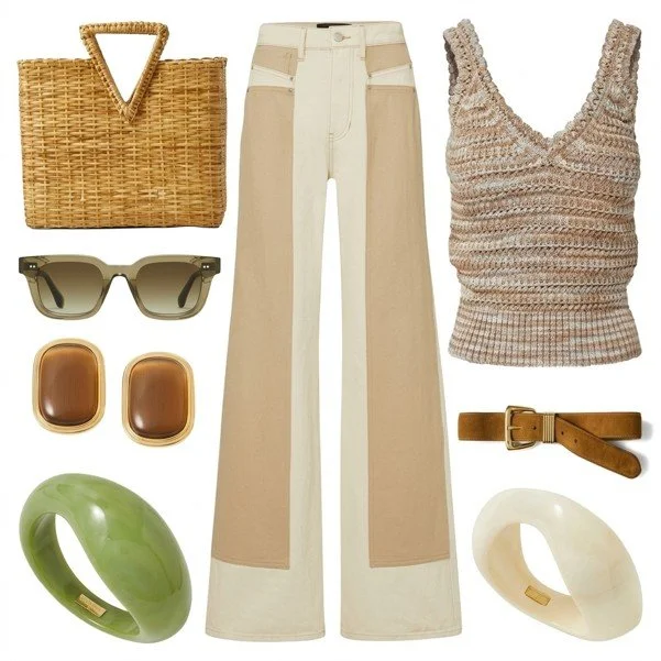
If you tend to stick to neutrals or safe shades, challenge yourself to incorporate more colour into your wardrobe. Start small with accessories (like a bold scarf or statement bag) or a single coloured piece (like a blouse or skirt). Over time, you’ll start to feel more comfortable and confident wearing bolder hues.
Try This:
Start with Accessories: A colourful belt, shoes, or jewellery can add a pop of personality to a neutral outfit.
Try a Coloured Blazer: A bright or pastel blazer can instantly elevate a simple jeans-and-tee combo.
Wear a Monochromatic Look: Stick to one colour in different shades (e.g., light blue, medium blue, and navy) for a sophisticated, cohesive look.
Let Your Colours Speak for You
Colour is one of the most powerful tools in your wardrobe. It can boost your confidence, influence your mood, and shape how others perceive you. By understanding the psychology behind colour and using it intentionally, you can dress with purpose and let your outfits reflect the best version of yourself.
So next time you’re standing in front of your closet, ask yourself: What do I want to say today? Then, choose your colours accordingly.
Your Next Steps
Not sure which colours suit you best? Book a Colour Analysis session and discover your personal palette.
Experiment with Colour: Try incorporating one new colour into your wardrobe this week and notice how it makes you feel.
Dress for Your Goals: Use colour to align with your intentions—whether that’s feeling more confident at work or more relaxed on the weekend.
Colour is just the beginning. If you're ready to build a wardrobe that truly reflects who you are, discover how personal stylist London One Of A Style helps women feel confident in what they wear.
PERSONAL STYLIST TIPS: OUTFITS FOR EVERY SEASON - SPRING EDITION
What if getting dressed in the morning felt easy? Not just manageable — actually easy. The right pieces, the right colours, no second-guessing at the till.
That's exactly what understanding your colour season gives you.
In this guide, I've put together two real, wearable outfits for each season — Spring, Summer, Autumn, and Winter — to show you how your personal palette translates into looks you can actually reach for and wear. Not mood boards. Not runway fantasy. Real combinations for real life.
Whether you're a warm, luminous Spring, a softly sophisticated Summer, a rich and grounded Autumn, or a high-contrast, jewel-toned Winter — your colours are waiting for you. And once you know them, you'll never shop the same way again.
Here's the thing: colour analysis isn't about handing you a list of rules and sending you on your way.
It's about awareness. It's about walking into a shop and instantly knowing which pieces will make your complexion glow, your features sharpen, and your whole look feel effortless — without second-guessing yourself at the till.
That clarity? That quiet confidence of knowing what works for you? That's what this guide is all about.
I've put together two real, wearable looks for each season — Spring, Summer, Autumn, and Winter — to show you how your palette translates into outfits you can actually reach for and wear. Not mood boards. Not runway fantasy. Real, stylish combinations that make sense for real life.
Scroll down, find your season, and let it inspire your next shop.
And if you're not quite sure where you land — if you feel like you sit somewhere between two seasons, or your colouring has shifted since we last connected — I'm here. A personalised colour analysis or update is the best way to make sure your palette truly reflects you: your life, your hair, your energy right now.
Let's get into it.
Spring: Warm, Fresh & Luminous
If you're a Spring, your palette is one of the most joyful to dress. Think peach, coral, cream, camel, and clear warm tones that bring an effortless glow to your complexion. Your colours are alive — and when you wear them, so are you.
The mistake I see Springs make most often? Playing it too safe in neutrals that belong to other seasons. Beige can work beautifully for you — but only your beige. Warm, creamy, golden. Not the cool greige that flatters a Summer. Not the ashy taupe that suits a Winter. Yours.
Here's how that looks in practice.
Look 1: The Refined Classic
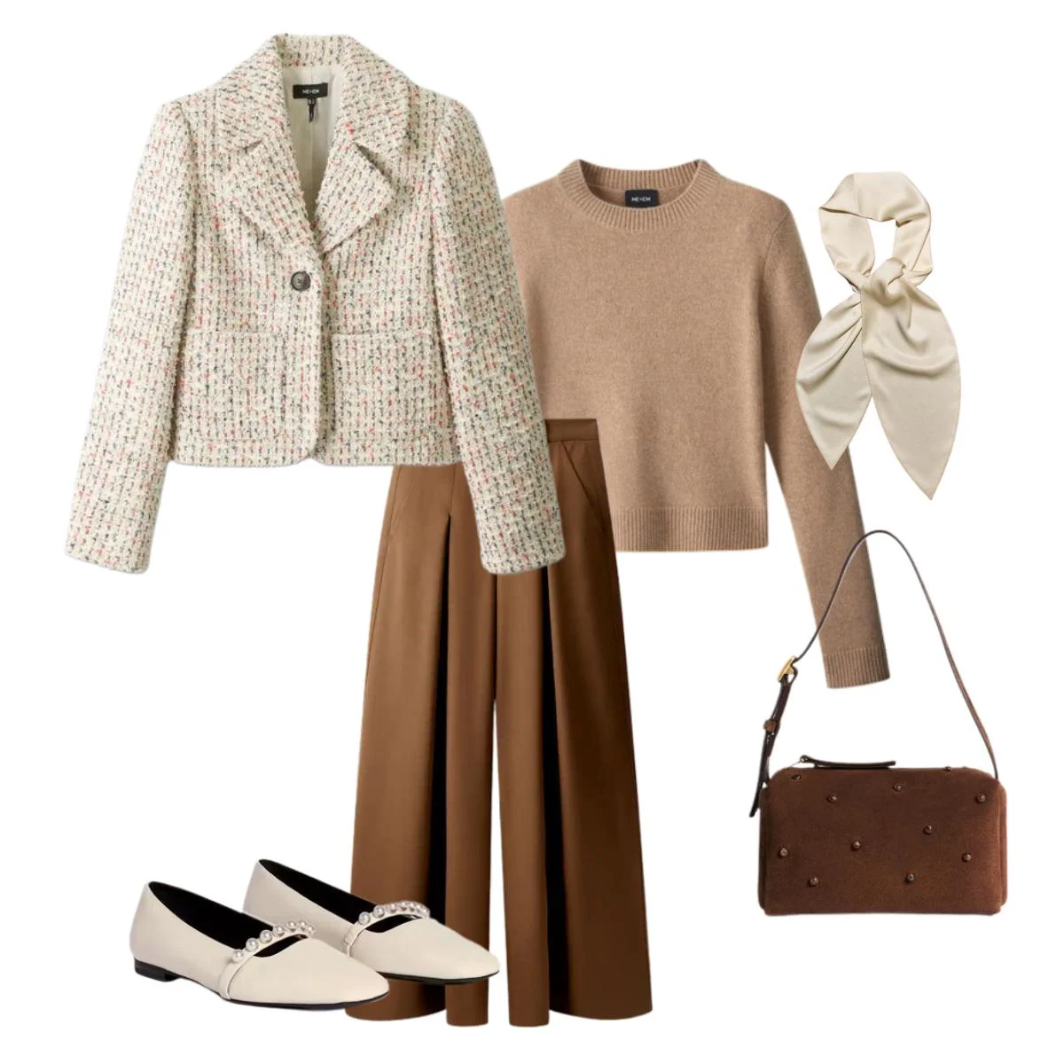
A soft beige palette built around a cream tweed jacket and camel knit, balanced with deeper brown trousers. It's polished without trying too hard — the kind of look that feels intentional and easy all at once. Perfect for spring days when you want to feel put-together without the fuss.
This is the power of knowing your season. You can build an entire outfit within your neutral palette and it sings. Every piece works with every other piece because they all share the same warm undertone. Shopping becomes simpler. Getting dressed takes less time. And you always, always look like yourself.
Look 2: The Modern Confidence
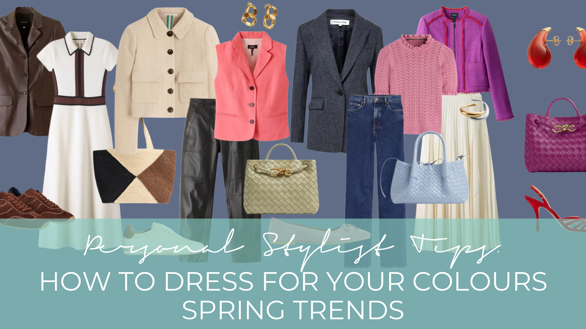
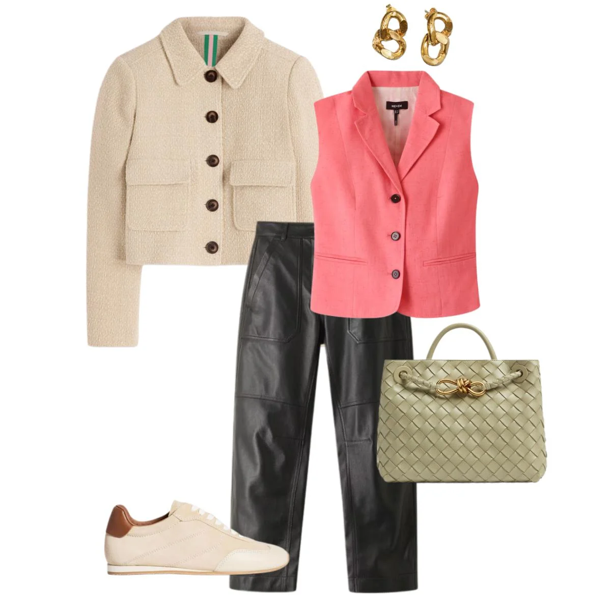
A coral sleeveless vest brings freshness and energy, balanced beautifully by black-brown leather trousers. Finished with trainers and a light green bag, this look is modern, confident, and completely wearable.
It proves something important: Spring palettes aren't just soft. They can be bold, vibrant, and electric. That coral isn't "too much" — it's yours. It's exactly the shade that makes your complexion come alive. Wear it like you know that, because now you do.
Summer: Cool, Muted & Softly Sophisticated
Summer palettes are cool, muted, and quietly magnificent. Think dusty pink, grey-blue, soft white, and lavender — colours that create an effortlessly elegant harmony with your natural colouring. There's a softness to Summer style that can easily be mistaken for playing it safe. It isn't. It's refined.
The biggest challenge for Summers? Being told to "add more colour." The instinct to reach for something brighter, more saturated, more there. But here's what I always say to my Summer clients: your palette IS the colour. That muted dusty rose, that soft grey-blue — they're not understated. They're sophisticated in a way that louder colours simply aren't, for you.
Look 1: The Effortless Monochrome
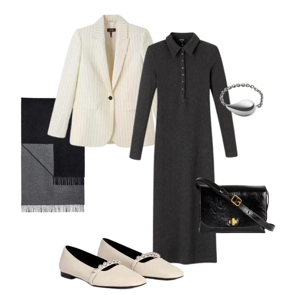
A dark grey long knit dress paired with an off-white blazer creates a soft, balanced contrast that feels cohesive from head to toe. Grey tones and matching flat ballerinas complete a muted, cool palette that's as comfortable as it is polished.
The whole outfit flows. It looks like you dressed without thinking — and in a sense, once you know your palette, you kind of do. Things just come together. Pieces connect. The morning gets easier.
Look 2: The Easy Summer Outfit
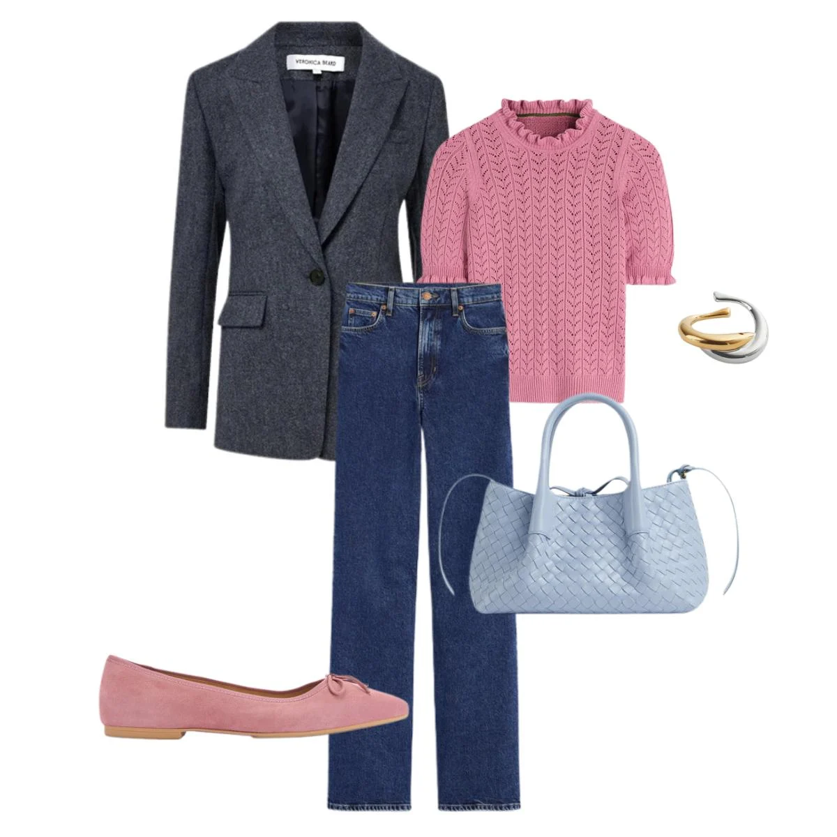
A dusty pink short-sleeve knit softens a classic base of jeans and a blue blazer — the kind of outfit that just works without overthinking. Pink flat shoes and a light blue bag tie it all together beautifully. Summer style at its most balanced.
This is the look I see Summer clients reach for again and again once they've had their analysis. It's become a uniform of sorts — in the best possible way. Reliable, elegant, and always, always right.
Autumn: Rich, Warm & Deeply Harmonious
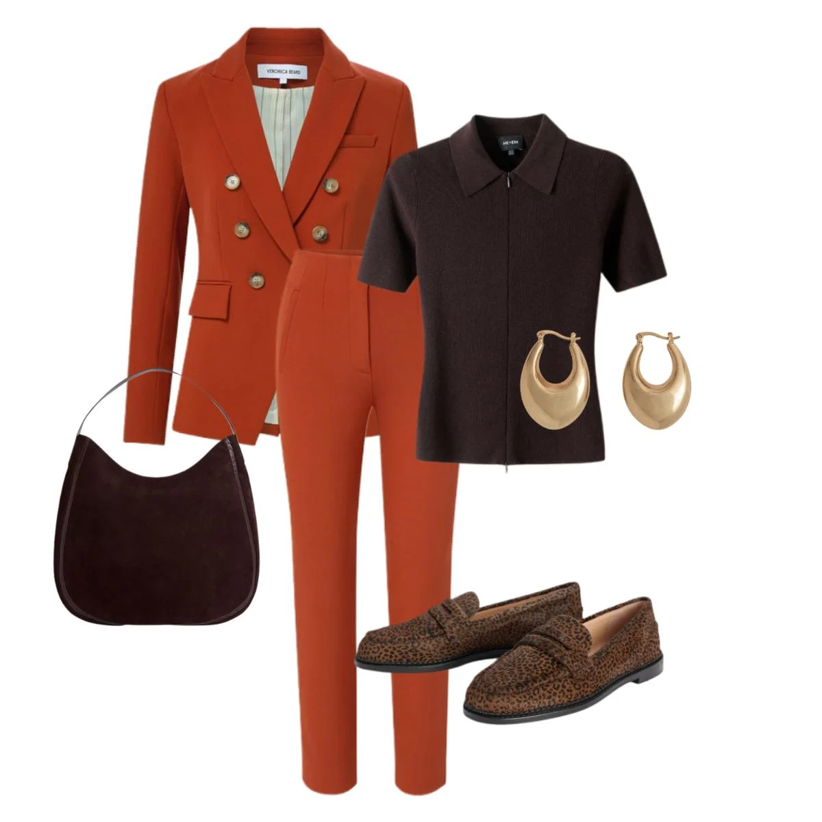
Rich, warm, and deeply their own — Autumn palettes are built for depth. Think terracotta, chocolate brown, burnt orange, cream, and olive. Colours that feel grounded, bold, and entirely themselves.
Autumns are often told to "brighten up" — to add something sharper, cooler, more eye-catching. But what those suggestions miss is that Autumn colouring is eye-catching, just in a different way. It's depth that draws people in. Warmth that feels magnetic. There is nothing muted about a terracotta suit or a rich chocolate blazer when they're exactly the right tones for the person wearing them.
Look 1: The Rich Neutral
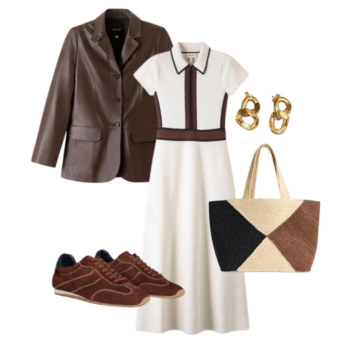
A cream and chocolate-toned dress layered with a dark brown leather blazer and deep brown trainers. This look leans into the depth of Autumn neutrals in the most elegant way — a rich, harmonious combination that feels luxurious without ever being overdone.
For Autumns, neutrals are everything. Your browns, your creams, your warm taupes — these are the tones that make your features sharpen and your complexion glow. When clients discover this, it genuinely changes the way they shop. Suddenly the "safe" option is also the stylish one. There's such freedom in that.
Look 2: The Warm Statement
A deep terracotta suit paired with a brown top and matching bag creates a look that's strong, refined, and completely season-aligned. This is Autumn at its most confident — a palette that makes a statement simply by being itself.
If you've been hesitating over terracotta or burnt orange — wondering if it's too much — this look is your answer. It isn't too much. It's exactly enough. It's yours.
Winter: Contrast, Depth & Clarity
Winter palettes love contrast, depth, and clarity. Think black, white, deep navy, pure red, and bright jewel tones — colours with presence that complement the cool, striking quality of Winter colouring.
Winters are often the easiest season to dress in black. And while black is absolutely your friend, I want to challenge you to go further — because your palette extends so much further than the safest colour in the wardrobe. Jewel tones, bold brights, sharp contrasts — these are all yours, and they do things for you that they simply cannot do for other seasons.
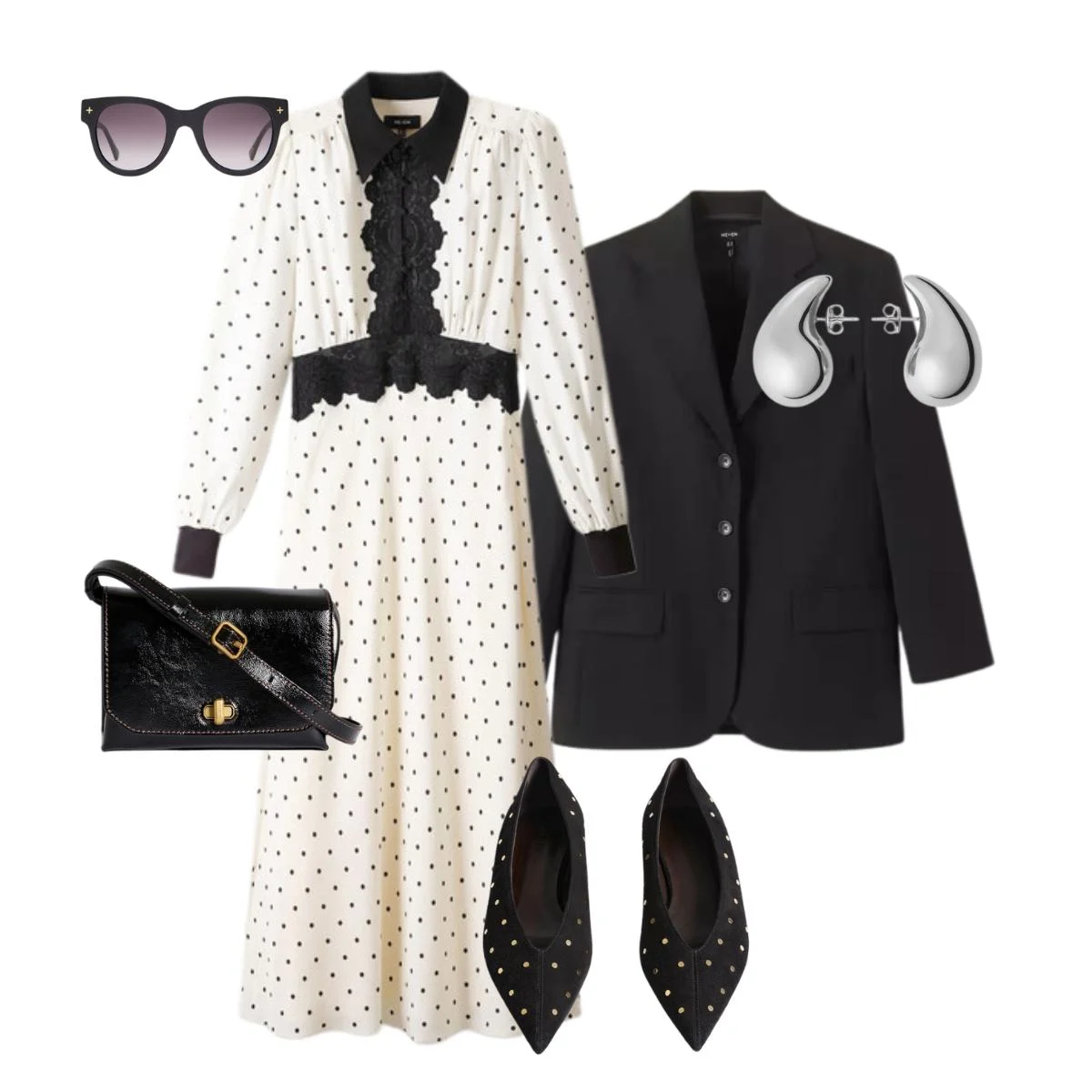
Look 1: The High-Contrast Classic
A black and white polka dot dress paired with a black blazer and matching accessories. Sharp, polished, and utterly essential for Winter palettes — this is the kind of look that never dates and always turns heads.
It works because contrast is your natural language. Your colouring is cool and striking, and high-contrast dressing honours that. It doesn't fight against you. It amplifies you.
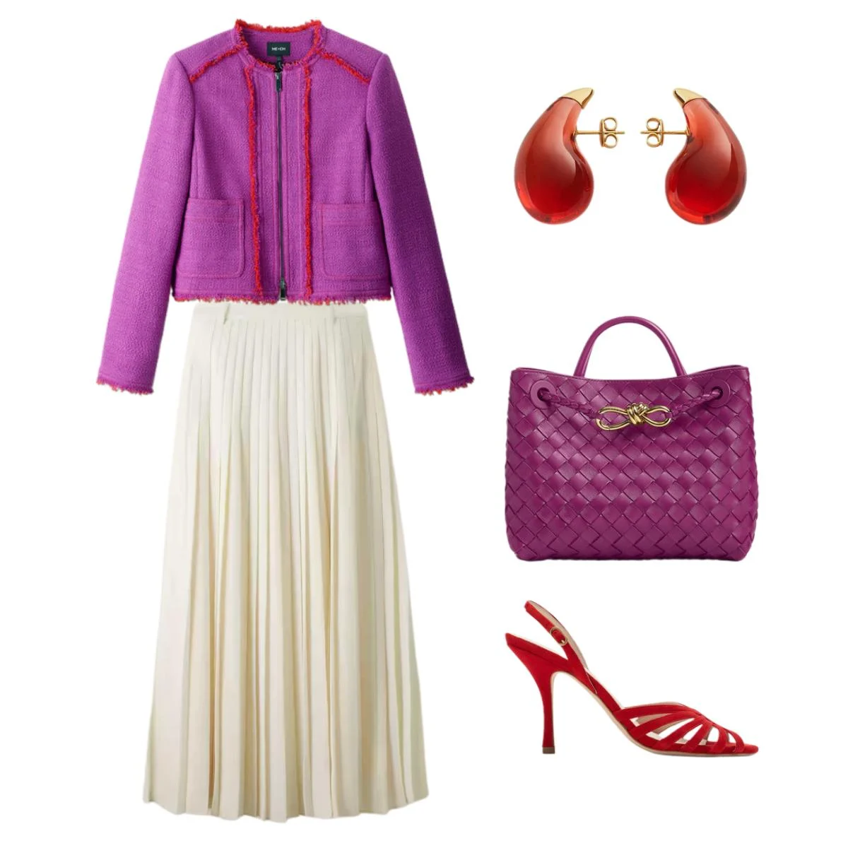
Look 2: The Bold Statement
A purple tweed blazer layered over an off-white pleated skirt creates a vibrant, polished base. Paired with a matching purple bag and red heels, this look showcases exactly what Winter palettes are made for — bright, bold colours worn with confidence and total ease.
If you're a Winter who has been playing it safe in black and navy — no judgement, I see it all the time — consider this your invitation. Those jewel tones you keep admiring on the rack? They were made for you. Try them on. See what happens. I think you'll be surprised by what you see.
The Real Value of Knowing Your Season
I want to say something that goes beyond the outfits.
Colour analysis isn't a styling exercise. It's a clarity exercise. When you know your season, you stop standing in changing rooms asking yourself does this work? and start already knowing the answer before you try things on. You stop buying things that sit in your wardrobe unworn because something felt slightly off, even if you couldn't name what. You stop wasting money, time, and mental energy on choices that were never going to be right for you.
What you gain instead is a wardrobe that makes getting dressed feel good. A shopping process that's quicker, easier, and more satisfying. And a quiet, unshakeable confidence that comes not from spending more, but from choosing better.
That's the work I do with every client. Not handing them a palette card and wishing them luck — but helping them understand why their colours work for them, so they can use that knowledge for the rest of their lives.
Ready to Find Your Season?
If you've been reading along and recognising yourself in one of these palettes — wonderful. Save your looks, bookmark this article, and let it guide your next shop.
And if you're not quite sure where you land, or if it's been a while since your last analysis and your colouring has changed — I would love to hear from you. A personal colour and style session is one of the most transformative things you can do for your wardrobe, and honestly, for how you feel in it.
Because style, at its best, is simply this: feeling like yourself. Turned up.
One Of A Style
London Personal Stylist